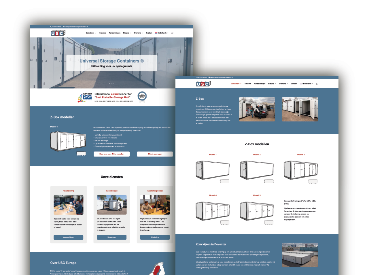
Tips and tricks for the ideal storage website

Images
Provide good photos that the customer can identify with, preferably of people who are looking at the visitor. Avoid the pretty but often uninformative images from the free image databases on the Internet. Make sure photos positioned side by side are well matched in color and light.
Texts
Although it seems like images are becoming increasingly important, it’s still all about good writing. Beautiful pictures only sell little. Provide clear and persuasive writing and tailor the language to the audience you are serving. Web texts contain relatively short sentences, paragraphs and headings. Don’t forget the keywords by which visitors will land on your website. That all scores in Google.
Think from the customer’s point of view
Many entrepreneurs naturally like to tell people how good their product is. But is this really what your potential customer wants to know? Visitors to a Web site have a problem they want solved. Name the problem and the consequences if nothing is done about it and then come up with your solution. Optimize your website for this and try to think of what questions the customer wants answered during certain moments of the decision process.
Responsive
Make sure your website is easy to read on all devices. Keep in mind that today about 50% of people visit your website using their cell phones. If a visitor doesn’t find what they’re looking for quickly, you’ve lost them.
Clear call-to-actions
What action do you want the customer to take? Always have clear call-to-actions on your website, preferably on every page. Also think carefully about the text in these call-to-actions. “I would like to speak to someone” is much more inviting than “Contact me.”
Unit
Ensure a good corporate identity and continuity in such things as color scheme, design language, fonts and writing style. Have this also reflected in your offline marketing materials such as flyers, banners and posters.
Overview
Keep you website organized with a clear menu structure that contains at most 6 items. A visitor must be able to find what they are looking for immediately, or they will quickly drop out and not return.
Up-to-date
Upload new content regularly and make sure your website is always up-to-date. This has a positive effect on search results in Google. Being active on social media can also significantly increase visits to your website.
Daan Leeuw, designer
